
ESSAY SERIES · HISTORY OF DATAVIZ · MEDIUM
The Data Visualizations of W.E.B. Du Bois: a six-part series
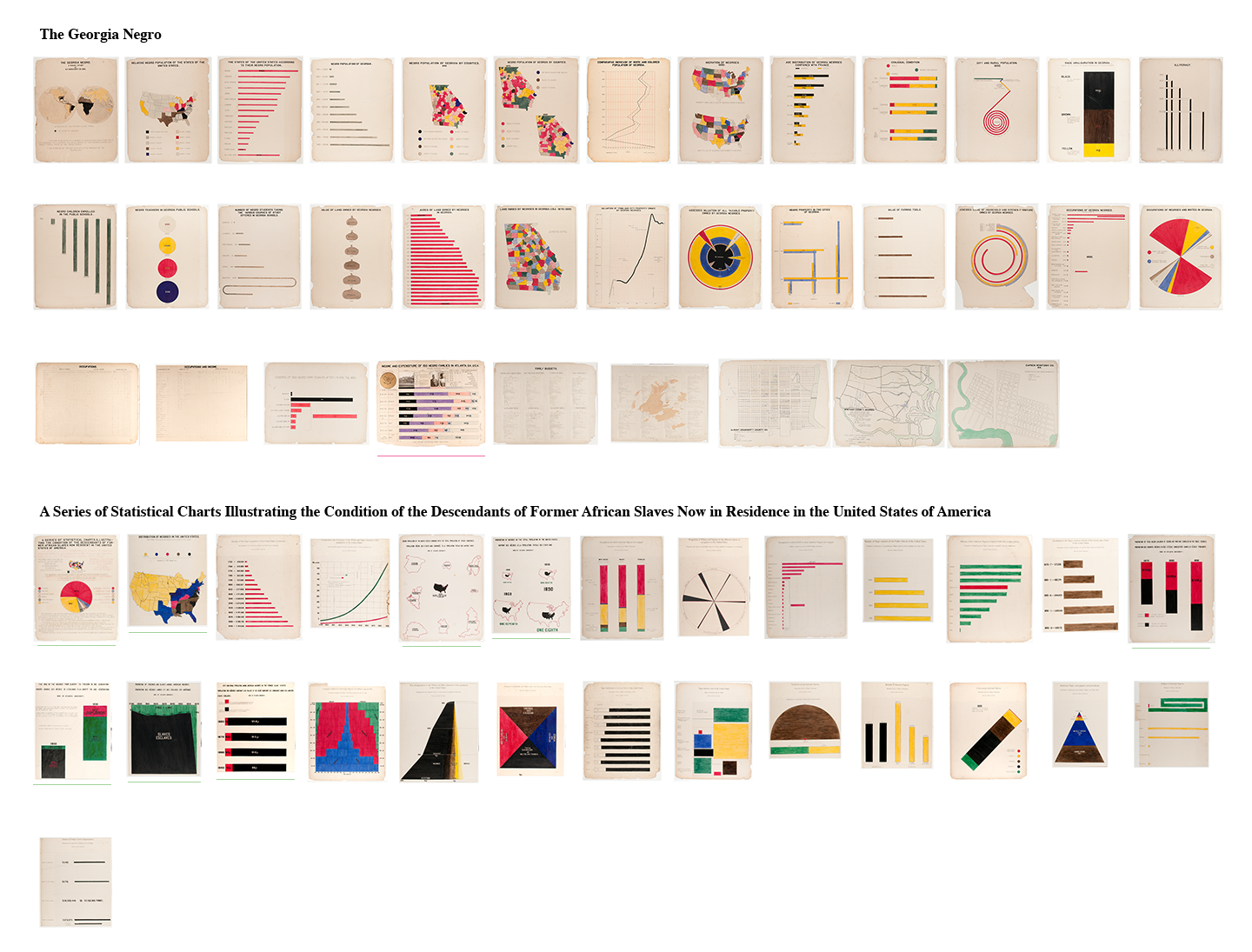
One of the most powerful examples of data visualization was made in 1900 by an all-Black team led by W.E.B. Du Bois, only 37 years after the end of slavery in the United States. I spent a year researching “The Exhibit of American Negroes,” made for the Paris Exposition, and wrote it up as a six-part series: the exhibit’s background, Du Bois’s methods as a social scientist, the craft of the charts, and what it was like to see an original up close.
The research became talks, including the 2020 Black History Month lecture at the University of Oxford, and it’s still the clearest case I know for data as a way of making people visible.
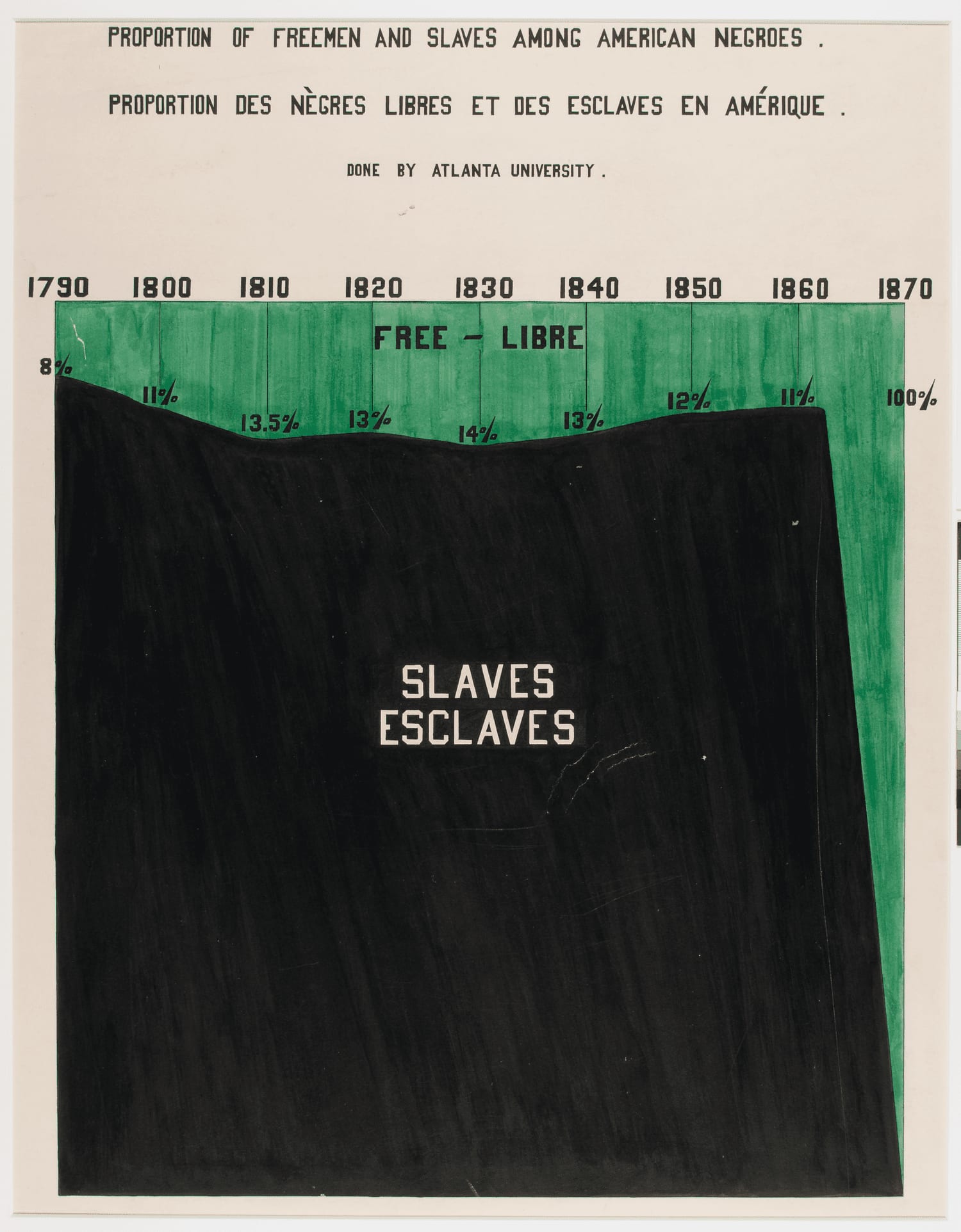 I. The Exhibit of American Negroes
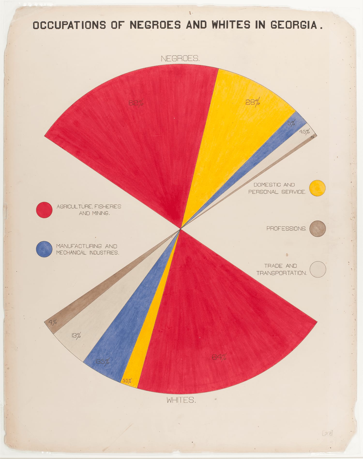 II. Data journalism and the scientific study of "the Negro problem"
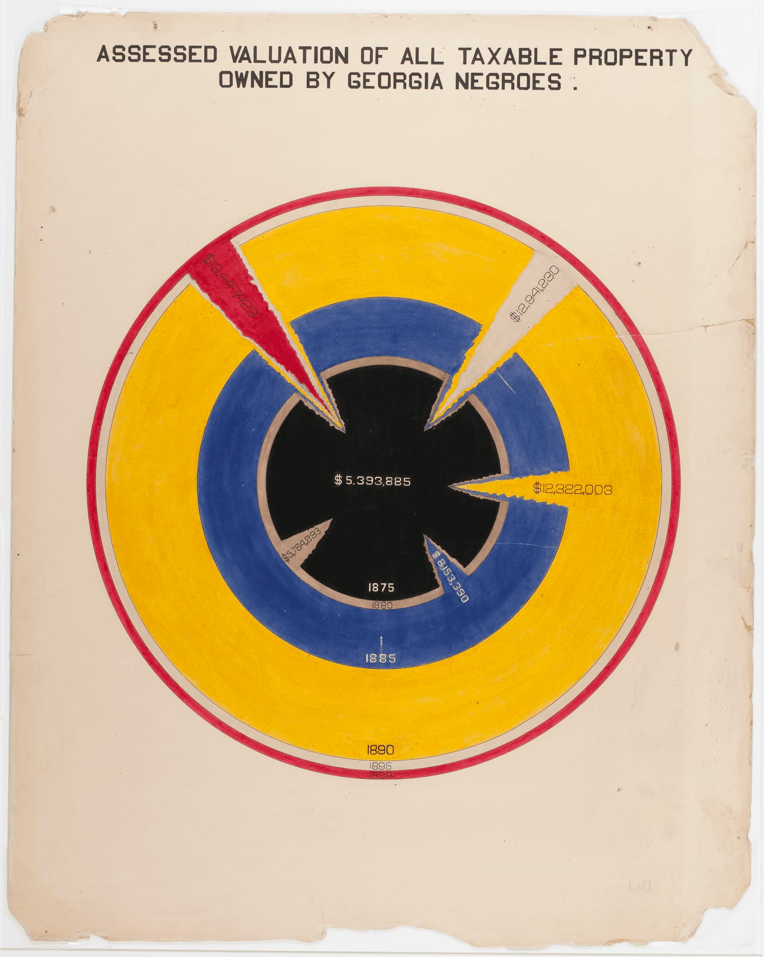 III. The craft and design of the charts
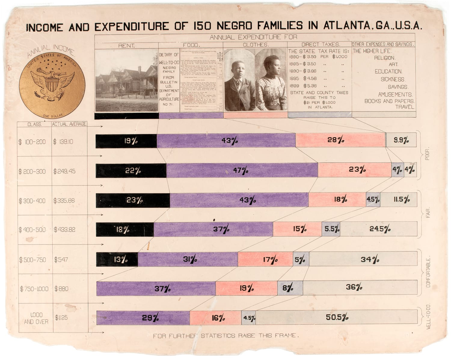 IV. Style and rich detail: viewing an original chart
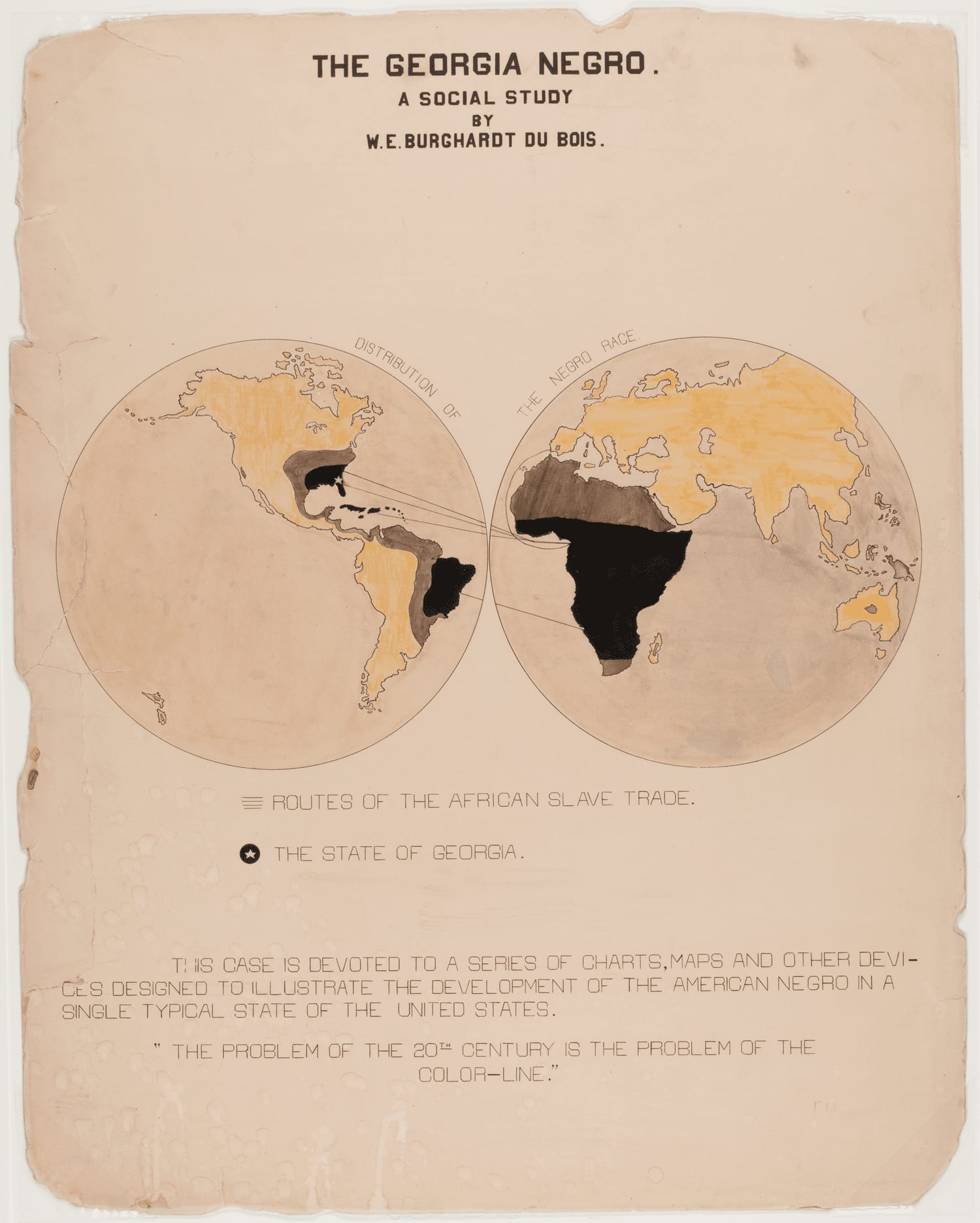 V. Du Bois as social scientist
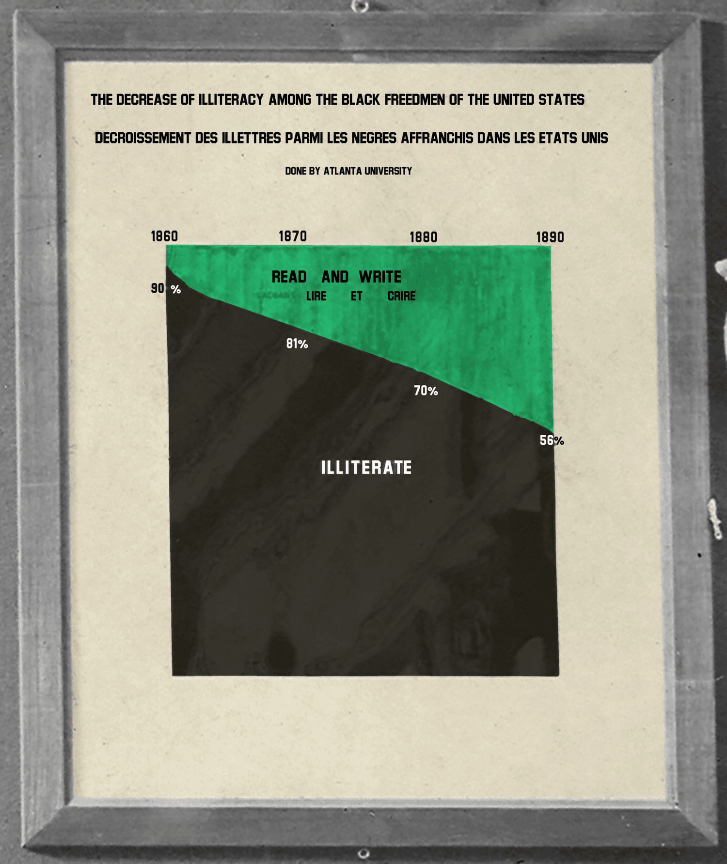 VI. The exhibition as a whole